The idea came from wanting a minimalist, always-on display that could serve as both a clock and an information hub. Wall Clock was built as a web app, making it accessible across devices and easy to customize.
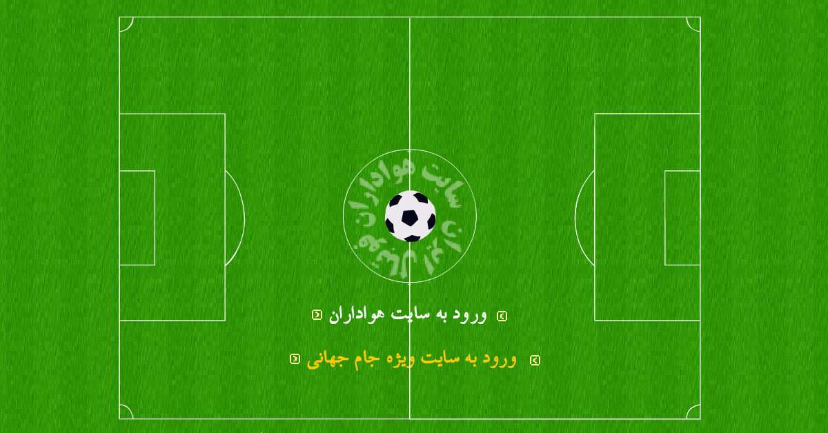
Entertainment websites face a unique challenge: the audience must be engaged instantly. Long loading times, static visuals, or delays in multimedia playback quickly lead to boredom—especially in sports‑themed platforms where energy and excitement are key.
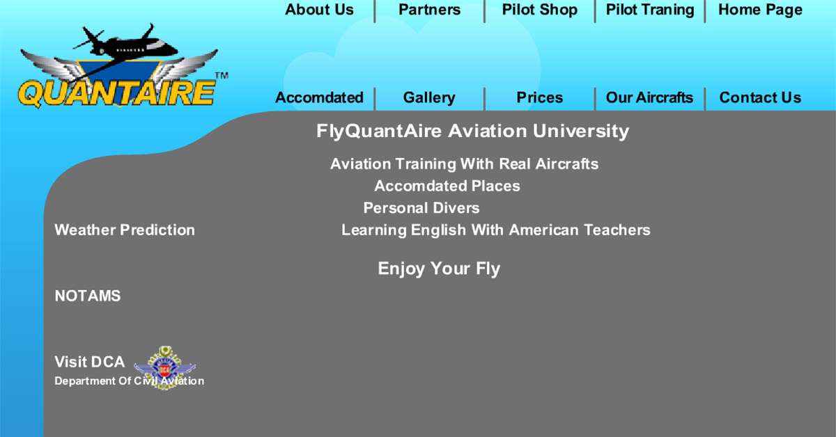
FlyQuantaire, founded in 2006, was a growing aviation community and training school offering city sky tours, flight training programs, and aviation services. To attract tourists, aspiring pilots, and aviation enthusiasts, the organization needed a website that delivered both visual impact and professional presentation.
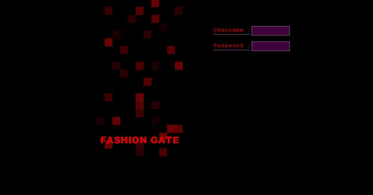
Fashion Gate was envisioned as a new online community for fashion designers and fashion enthusiasts, requiring a visually captivating interface that matched the style-centric nature of the platform. The login screen and intro animation needed to feel modern, dramatic, and expressive—something that immediately captured attention.
This project involved designing a Flash-based website template for a car tuning company, created to capture the high‑energy and performance‑focused culture of automotive customization. At the time, animated Flash websites were widely used to deliver immersive and visually striking experiences, especially for industries where visual presentation played a major role.
In the early days of the web, Flash‑heavy websites with intricate animations and graphics were extremely popular. While visually impressive, they often came with a major drawback: slow loading times, especially on limited internet connections and less capable browsers. Users were forced to wait through lengthy preloaders before accessing even basic content.
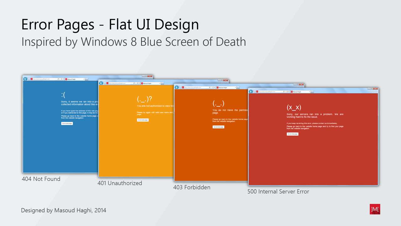
This project focuses on designing a complete set of website error handler pages, intended to inform visitors when they face accessibility or permission-related issues. Each error type—such as “404 Not Found” or “401 Unauthorized”—requires clear communication and a visual style that quickly helps the user understand what went wrong.